© 2018, Zach Evetts
© 2018, Zach Evetts
Business Center is an AT&T enterprise portal where users can access tools they need to manage, run, and grow their businesses. However, something that was missing from earlier iterations was a 'Reports' section, where users could view, analyze and download detailed information regarding their account activity. Our team was tasked with creating a brand new Reporting framework for Business Center.
Check out the prototype here! (send password request to zaevetts@gmail.com)
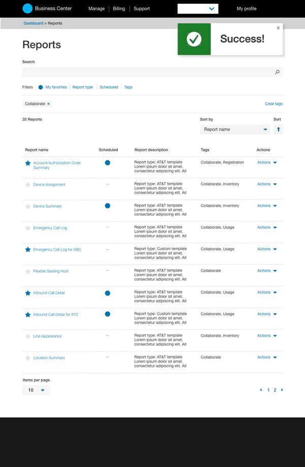
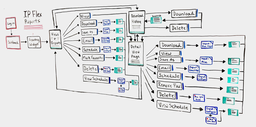
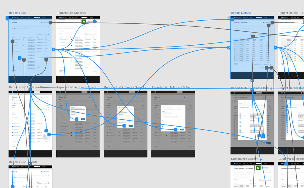
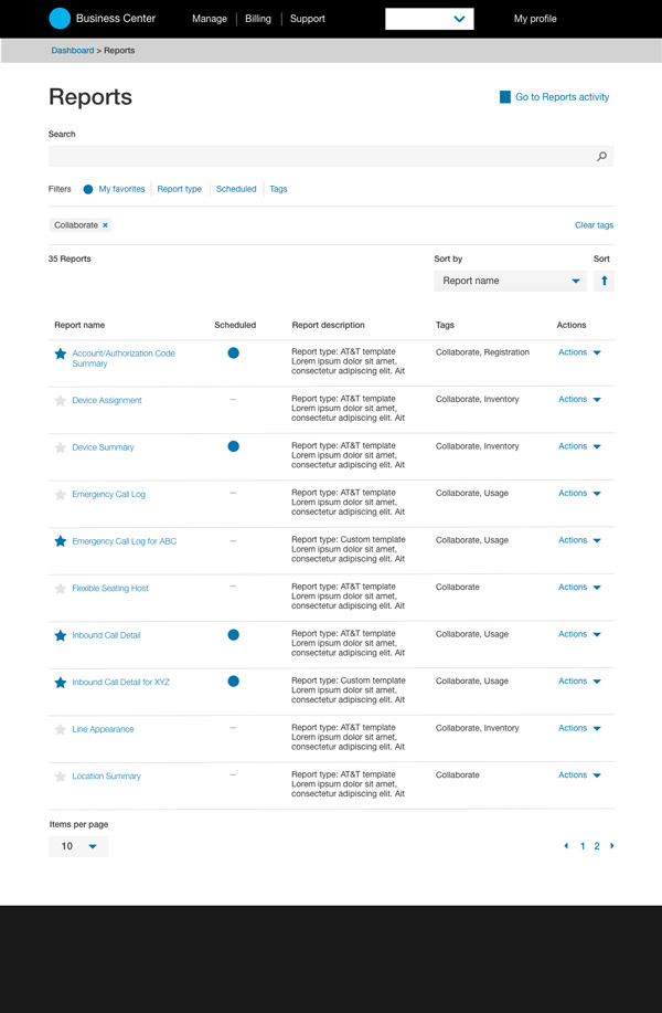
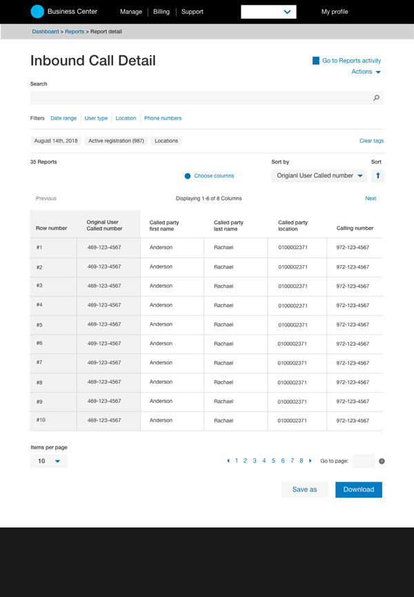
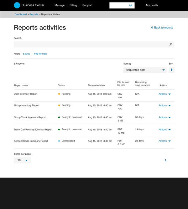
Some of the biggest takeaways from user research was the importance of seeing each reports' detailed breakdown, and also for the ability to customize and schedule said reports. With this in mind, the proposed framework was broken into three main pages; The Report list page, the Report detail page and Report activity page.
To offer a truly unique and robust reporting experience, certain actions and functionalities are found on all 3 pages to help users complete their tasks all in one place. These include, but are not limited to:
Schedule report - Users can automate report distribution via email by any month, day and time.
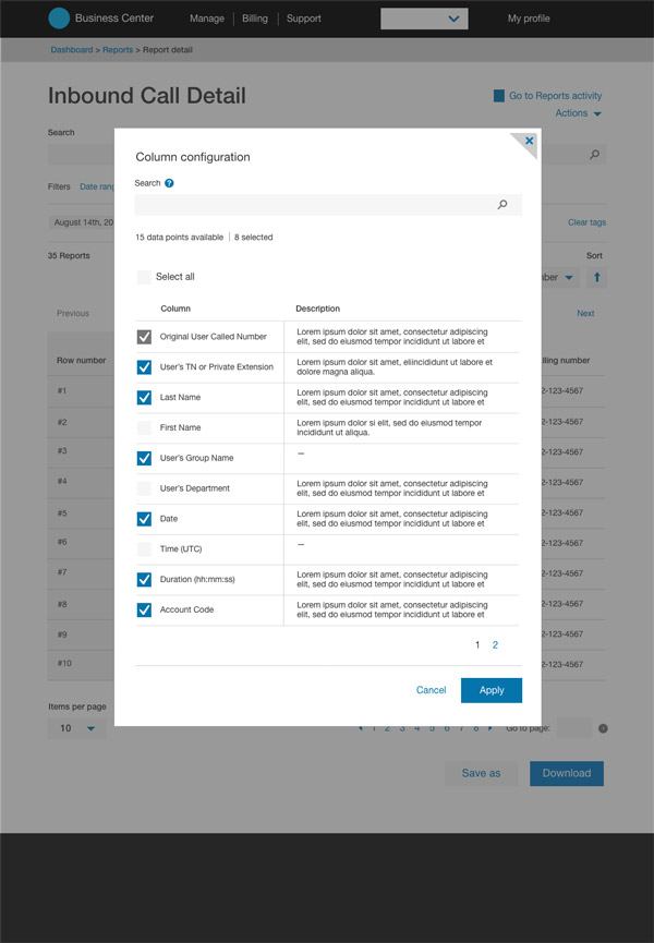
Column Configuration - Users have the ability to customize any reports' data points by adding or removing columns, and setting the order in which said columns are displayed, so users get the exact information they need in their report view.
Favorite reports - Users can mark reports as 'favorite' so customized reports are easier to search and filter by.
Launched in late 2017, the new reporting framework has been well received, with the number of users steadily increasing month by month.