


© 2018, Zach Evetts
© 2018, Zach Evetts
During a project in which the ‘Log in’ page on AT&T Business Center was to be enhanced in areas with usability pain points, I was tasked specifically with researching & designing a better ‘Password creation’ experience.
Because of security restrictions, the current state of the password creation is boiled down to a list of criteria a user must fulfill in order to create an acceptable password, but with no indication in real time when they pass certain criteria OR just how weak/strong their proposed password actually is. So, how can we improve this experience given the limitations of security liabilities? Will it require the creation of a new, compliant pattern? How exactly do some of AT&T's competitors solve (or not solve) this issue?
This last question led me to do an informal competitive analysis, along with a review of existing AT&T patterns' viability for this enhancement.
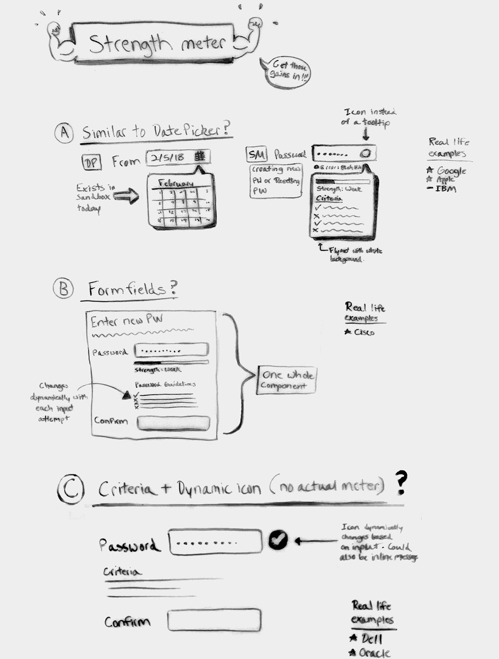
After researching various competitors’ password creation experiences, I listed 3 of the most common patterns among them, listed which of those 3 is similar to any of AT&T’s existing components/patterns, and analyzed the viability of them in relation to security restrictions.
In this pattern, a flyout appears from the password input as the user creates a new password. The flyout shows the user all of the criteria they must meet to create a succesful password, and also a strength meter to indicate how secure their new password is. Although some competitors show individual criteria completion and password strength in real time, for AT&T's purposes, it would only show after submission to reduce security risks.
Form fields for new password input and password validation are also a common pattern, with a list of criteria normally found in between that dynamically change to show pass/fail, as well as a strength meter. Though the pattern could be adjusted for security risks, no similar pattern exists in AT&T's design library to build off of.
A password input field without a validation field, plus criteria, is also a commonly used pattern. But, in this example, a strength meter is replaced by a dynamic icon that appears when a user has succesfully completed all password criteria. Due to AT&T's strict security protocol, the icon functionality would be rendered useless for our purposes.
After the preliminary competitive analysis, it was determined that the best direction to move forward with was option A, since AT&T has similar components in place that could accommodate password strength enhancements, which would save on scope compared to building a brand new component that may not be best suited for the job.
Given the security limitations and familiarity with the pattern, we felt that option A would be the best experience for our users when introducing an enhanced password creation flow.